About Our Project
Data Visualization # 1: Population over Time
This is a video of our first vizualization showing population from 1952 to 2007.
Data Visualization 2: GDP per Capita over Time
This is a video of GDP per Capita across the world from 1952 to 2007.
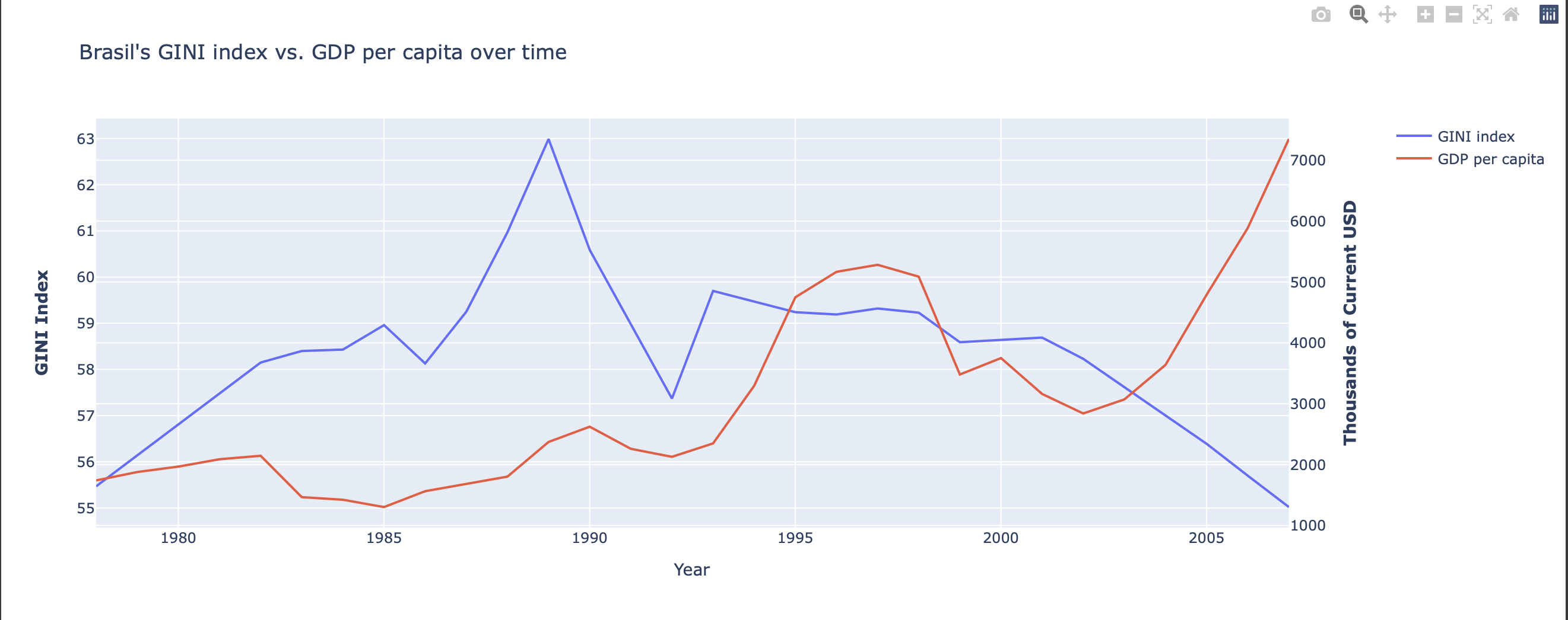
Data Visualization #3: Brazil's Gini Index vs GDP per Capita Over Time
Brazil Gini Index vs GDP per capita (1978-2007) There is an inverse relationship, when GDP per capita is higher income inequality (GINI index) is lower vice versa. This makes sense to us because when GDP is higher there tends to be higher incomes in the population and better allocation of wealth which leads to a lower GINI index.

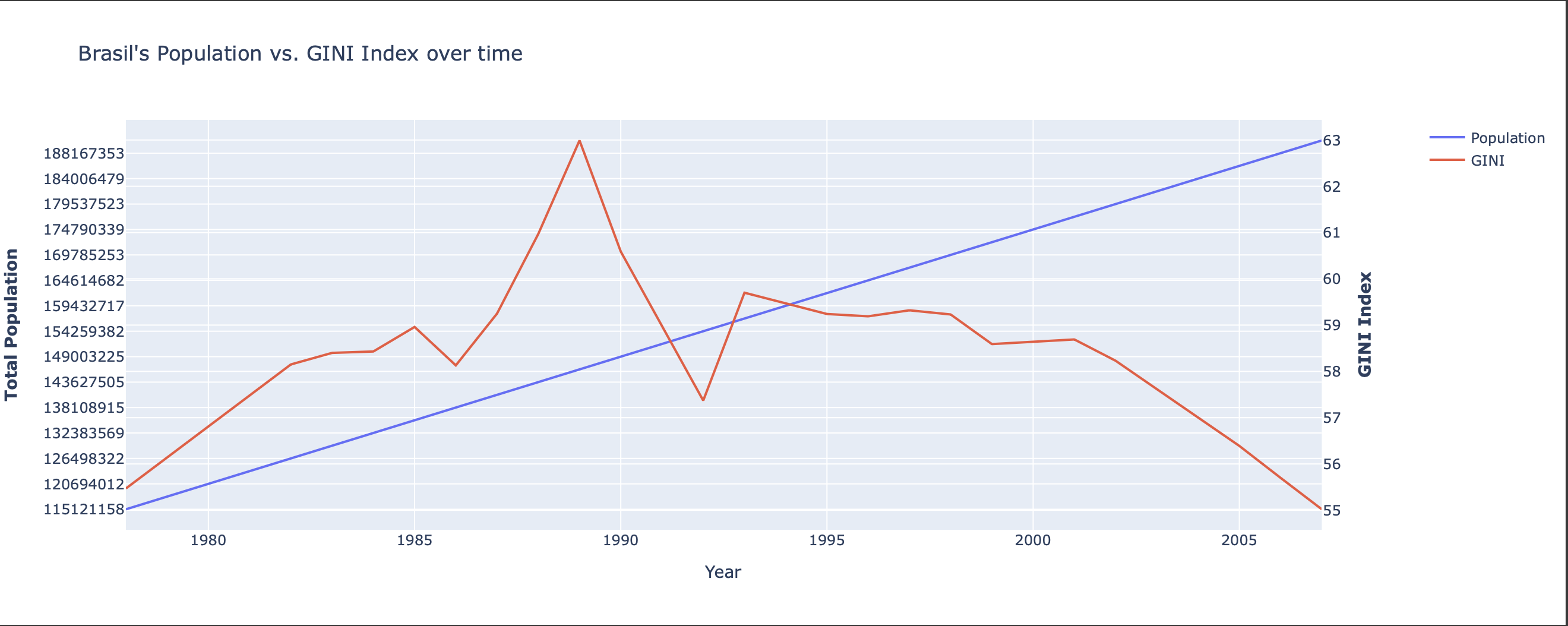
Data Visualization #4: Brazil's Population vs GINI Index Over Time

Brazil Gini Index vs Population (1978-2007) Population increases linearly over time, whereas the Gini Index does not, it seems like, have a relationship with population growth. We cannot say for sure if there is a specific relationship between population and the Gini Index. However, we can see that there may be an inverse correlation specifically after the year 1995. We can theorize that income inequality decreases because of innovation like technology amongst other things.
Project Run Through
This is a video of us running through are project. This video is intended for those who are familar with python and coding. This is the process of how this project came to be.
Conclusion
We wanted to use this project opportunity to combine what we learned in computer science to our economics majors by using questions of income inequality as a means to do this. We were curious about what income inequality looks like across the world and how countries compare. We would hope for someone who is interested in economic questions of income inequality, such as an economist or a social scientist, to use this project as, maybe more so, an inspiration to combine concepts of python to visualize economic research. We chose data sources of the Gini Index and Gapminder to compare the Gini Index to other country measures like Population Counts, GDP per capita. While working on this project, we discovered that many countries rarely measure the Gini Index, Brazil was one of the only countries that measured it frequently. So, we used the first two visualizations to put the GINI index into context of measures of population and GDP per capita. The second two visualizations, we compare Brazil’s GINI index to Brazil's population and GDP per capita. Further discussion of what we observed is above.